Link in Bio Examples: What Good Pages Look Like and Why They Work
Real link-in-bio page patterns organized by goal. What works for selling, what works for list building, what works for hubbing multiple platforms, and what the best pages consistently have in common.
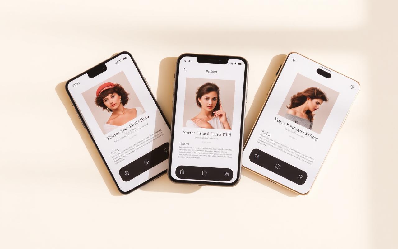
The best link-in-bio pages don't look like link lists. They look like a small, purposeful landing page with one obvious next step. What separates a page that converts from a forgettable one isn't the tool — it's how well the layout matches what the audience actually wants when they tap through.
The short answer
The strongest pages have one goal, five to seven links, branding that matches the feed, and a load time that survives Instagram and TikTok's in-app browsers. Put the thing you are promoting this week first. Capture email above the fold. If you sell, check out on the same page — Beacons and Stan Store can embed product cards; Paage runs native checkout for digital, physical, events and gift cards so the visitor never waits on a second site.
What the strongest pages have in common
Across every page we studied, five patterns showed up over and over.
- Fewer links, more clicks. Pages with five to seven focused links reliably outperform pages with fifteen. Every extra link competes with every other link.
- The important thing is first. The top link is tapped roughly ten times more than the fifth link, and roughly a hundred times more than the twelfth.
- It looks like the person who made it. If the feed is muted and editorial, a neon link page breaks trust in half a second.
- It loads fast. Every extra second of load time on the in-app browser costs measurable clicks.
- It updates. A page still pushing a Summer 2024 collection in March 2026 signals nobody is home.
Pages built to sell
Coaches, illustrators, small brands and course creators typically lead with the product and put social links secondary. The layout is usually a header image, a one-line positioning statement, one prominently featured product with the price visible, and three or four supporting links below.
The single biggest lever here is where the checkout lives. Pages that route the buyer out to a separate storefront lose conversions on every redirect. Pages that check out on the same page consistently do better.
Pages built to grow an email list
The list-first pattern is simple: signup block above the fold, one specific lead magnet, then the link list beneath. "Get my content calendar template" converts three to five times better than "join the newsletter," every single time we tested it.
The strongest examples we saw used dynamic segmentation from the start. A subscriber who tapped in from TikTok got tagged differently from one who tapped in from Instagram, and each received a different welcome sequence. That's the kind of thing a native email tool inside a link-in-bio platform handles cleanly — with Paage, for example, list membership updates automatically based on which link was tapped.
Pages built to hub multiple platforms
Podcasters, YouTubers and multi-platform creators need the bio link to work as a directory. The right layout groups links by type — content in one block, shop in another, socials at the bottom — rather than listing everything flat.
The counterintuitive rule is to keep the list under eight items even if you're on twelve platforms. Audiences don't scan long lists; they scan short ones. Pick the platforms that actually matter and skip the ones that don't.
Pages built to promote time-sensitive content
Some creators rotate their top link constantly: new video this week, product launch next week, event the week after. The URL never changes, but the featured content does.
The strongest version of this pattern pins the current promotion at the very top with a clear label ("New this week," "Launches Friday") and keeps two or three evergreen links below so late arrivals still find something useful.
Pages built as personal brands
Freelancers, consultants and creators who are the product treat their bio page as a mini portfolio. Short two-line bio at the top, a portrait or branded header, then links organized by what a potential client cares about: portfolio, testimonials, booking page.
For this pattern, native event booking and native gift cards matter more than you'd think — the freelance version of "buy a gift card for my services" turns out to be an underused offer that Paage supports out of the box.
The pattern that ties them all together
Every strong page we reviewed had exactly one primary action and treated everything else as secondary. The primary action was the thing the creator most wanted a stranger to do that week. Everything else — the socials, the older content, the newsletter — was arranged to support it, not compete with it. If your page has three co-equal top links, all three are underperforming.
Tools that make it easy to iterate
Any tool with a decent editor can build one version of a good page. The tools that keep making it better over time are the ones where updating the page from a phone is genuinely painless. That's why the tools we recommend most often for creators who iterate weekly — Paage, Linktree and Beacons — are also the ones with the best mobile editors.
A note on Carrd and "mini websites"
Freelancers sometimes skip link-in-bio tools entirely and build a one-pager in Carrd. That can look more like a portfolio. The tradeoff is you usually bolt on Stripe, an ESP and a scheduler yourself. If the job is still "one URL in the Instagram bio," a creator OS is less romantic and faster to operate from a phone.